Monday, 23 December 2013
PATIENCE (AFTER SEBALD) I Official UK Trailer
http://www.youtube.com/watch?v=mcBvnzr1v5k
Patience (after sebald)
Decided to do a bit of research during the christmas break, and well i actual watched this film, Patience (after sebald), before the break and i found it very hard to stop watching. Even though the book The Rings of Saturn wasn't about photography, it gave me idea's i wouldn't mind trying. The book it self wasn't in anyway easy to read, it kind of forced you to read and view the images in the book multiple times and sometimes i wouldn't understand whole sections until i read further, but the film helps understand the book and puts into context. The narrators melancholy reflects that of the book perfectly and the symmetry there doesn't go unnoticed.
Monday, 9 December 2013

http://www.imdb.com/title/tt1822263/plotsummary?ref_=tt_ov_pl
MOONBUG
About Steve Pyke and his journey across america to photograph astronauts and people who have walked on the moon.
given this to watch and all i was told was that it was about steve pyke, i found it to be Informative and compelling, helps to think about my style and developing my style by watch him.
Wednesday, 27 November 2013


The camera i used for these shots was a Cannon 5D mark 2 with a Metz flash. The models name is Rochelle Olliphant who is one my piers. i liked the colour's that she was wherein this day, they are complementary, she has a style all of her own. I did a bit of editing on Capture One for these, but did very little to them as i didnt fell they need a lot doing to them.


Tuesday, 19 November 2013

martin parr
last resort
http://solid-uncoated.blogspot.co.uk/2011/02/martin-parr.html
some of parr's work looks set up and unnatural though actually its not
there's something that feels forced about this image, i'm probably taking
the whole thing out of context
this image has a tension of its own, and i don't think i really need to point it out
to be honest
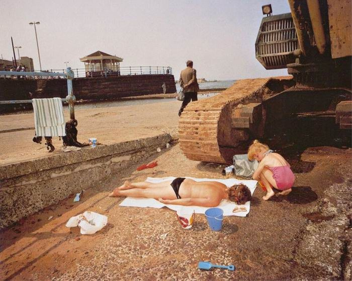
Martin Parr
the last resort
http://iconicphotos.wordpress.com/2012/02/27/the-last-resort-martin-parr/
Parr's work is very controversial and still has the ability to get people talking
weather you like it or no, there's something about his work
he goes against the traditional rules of photography, not adhering to them and in some case braking them.
his use of flash though is what i like, creating shadows with it. There's a very playful nature to his work, and there's a certain balance to his work. The objects in this image shouldn't work but they do, and represent what he's trying to represent.
Thursday, 7 November 2013

sir John Cornforth
by Nick Sinclair
you can tell allot about a person from there face, like this guy, Sir john cornforth, his sly and the twinkle in his eyes say's to me that he probable has a good sense of humor.
The photographer has chosen to to use a shallow depth of field focusing on his face, his suit falls out focus,
Thursday, 10 October 2013

Friday, 17 May 2013
evaluation of still and scapes
Evaluation
This project was a split/ duel project on
landscapes and still life having 14 weeks on the project as a whole, with
landscapes being ten weeks and still life four. We started with still life and
I didn’t have a clue what to expect, so I went into the project with a clear
mind and didn’t think much about it to begin with. But after spend three or
four hours in the studio trying to get the light right, which i found that to
be biggest challenge of these project.
So I ended up spending more and more time in the studio lighting
different objects in different ways I finally ran out of time to practice and
had to do the shoot, it all seemed to come together on that day, the natural
light was terrible. I had practiced for that and quickly set up the studio
lights and looking back that was the right decision and I am really happy with
my final print. There was also the fact that we were using to completely
different formats and the challenges that I would be facing with each would be
different, the first was digital, now I’m not a big fan of digital preferring
film, but I handled the Cannon d5 quite aptly my. The 5’ 4’ camera I had never
used before and the experience was eye opening, I really enjoyed the experience
and will definitely be using it again. There are benefits with both formats,
with film being that you can take a lot of photo quite quickly but printing
multiple c-types can be quite expensive, were as film especially large format
gives you extraordinary detail if taken correctly, but get it wrong and you can
easily waste money taking multiple photo. The landscapes part of the project
was my favorite I really enjoyed the experience of using the large format
camera but I a made a few mistakes the main one being the I double exposed one
my negatives.
Tuesday, 14 May 2013


http://www.olex.org/blog/?p=3975
Oliver lins
The red in the sign is really eye catching
and draws attention to the black watermarks under the screws on the bottom left
and right of the sign. The signs vibrancy also makes everything else, all the
plants and weeds seem quite lifeless, but I feel this is a good thing as it
adds rather than drawing from the picture and makes it work.

http://www.olex.org/blog/?p=3975
Oliver Lins
Quite like the fence in this photo, not
sure about the fact that it’s a colour photo, though I don’t think it would
work as well black and white. They could of done it at a different time of day
and maybe got more light on more of the objects in the fore, as it’s quite dull
and a bit drab but if the light was coming from a different direction it pick
up the colour of the pipes, but that’s just my opinion. Other that its quite a good photo and I quite
like it.

http://www.prixpictet.com/portfolios/growth-shortlist/edward-burtynsky/
Burtynski
Had to have this in my research somewhere.
At first I found this amusing, because I
thought think about the traffic jam if all these cars tried to leave at the
same time and I found that to be most amusing, I don’t really know why though.
It’s the uniformity again that I like. I find that that is a playing factor in most
of burtynski’s photos.

http://www.zeitgeistfilms.com/DVDpressroom/2012.html
Burtynski
This burtynski picture kind of needs
explaining because if didn’t know it I don’t think it would have such an effect
on you. This is photo of a city but all the people who lived there were paid to
destroy there homes, image that not only were they made leave they were made to
destroy it as well.
There
is certain feeling you get from it that’s hard to describe, when you know the
story behind it, it takes on another meaning and changes how you look at. The
owners of the homes did all the destruction in the photo; I find it hard to
comprehend how that would feel.
Subscribe to:
Posts (Atom)